Network Path Analyzer
I led UX design for Network Path Analyzer, giving customers a visual way to simulate and troubleshoot network paths in Oracle Cloud Infrastructure (OCI) before sending live traffic, reducing dependency on support for diagnostics.
My role
Lead UX designer (creation of new service and future feature releases)
Cross functional team
UI Engineers, API Engineers, Product Managers, Technical Content Writers, Solutions Architects
Project timeline
3 months (design phase for initial release)
The problem
Oracle enterprise customers manage complex hybrid networks that span on-premises systems, OCI, and other public clouds. Setting up these connections requires configuring many components, such as gateways, route tables, VPN tunnels, and security groups, which often leads to misconfigurations or missed steps. When issues occur, customers lack effective self-service tools to diagnose and fix problems, resulting in heavy reliance on support.
Analysis of a 13-week period showed that 13% of support tickets were directly caused by OCI networking misconfigurations, and another 20% involved a mix of OCI misconfigurations and external network issues. Common errors included incorrect route entries, incomplete configurations, and overly restrictive security rules. These patterns highlighted the need for better diagnostic capabilities to reduce support dependency and accelerate troubleshooting.
My impact
I designed a net new OCI service that simulates network traffic paths to help customers quickly diagnose misconfigurations, validate connectivity intent, and verify setups before sending real traffic. By simplifying a highly technical process into clear workflows and visualizations, I empowered users to troubleshoot issues independently, reduce support reliance, and deploy with greater confidence.
The process
- Expert interview
- Project planning
- Audit other cloud providers
- Document all user workflows
- High fidelity mocks
- Clickable prototypes
- Review and iteration with stakeholders
- Customer interviews
- UX review board approval
- Developer support
- Design new features and UX improvements
Phase 1: Discovery
Kickoff and SME interviews
I kicked off by interviewing subject-matter experts to understand the project, asking questions to identify the users, what tasks they need to perform, and what our constraints are. Early on, questions centered on how best to visually represent nodes, hops, and resource relationships. I captured all affected workflows and screens, and aligned on timeline expectations.
Competitive and inspiration audit
To see how others solved similar challenges, I audited offerings from major cloud platforms (Azure, AWS, Google Cloud) and infrastructure monitoring tools like SolarWinds. I specifically looked for visual approaches to node relationships, representations of key metrics, and how to manage scale of large topologies. These insights surfaced patterns like expandable areas or popups to show more information that we could adapt, and pitfalls to avoid like overly cluttered displays.
Storyboarding
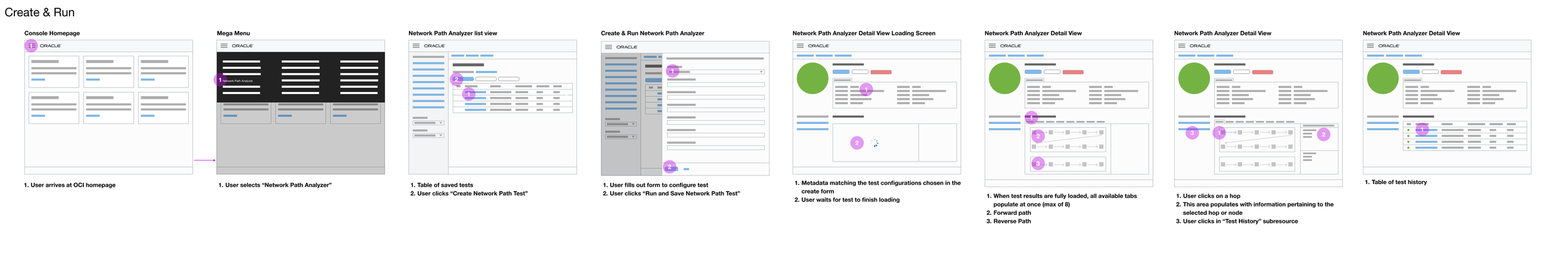
I sketched storyboards covering the core user journeys — creating a new path test, editing, interpreting results, handling incomplete paths, and deletion. These storyboards helped me visualize how users move through tasks and where decision points occur. After internal review, I presented them to stakeholders to align on flow logic and surface necessary edge cases before diving into mocks.
Phase 2: Designing the core experience
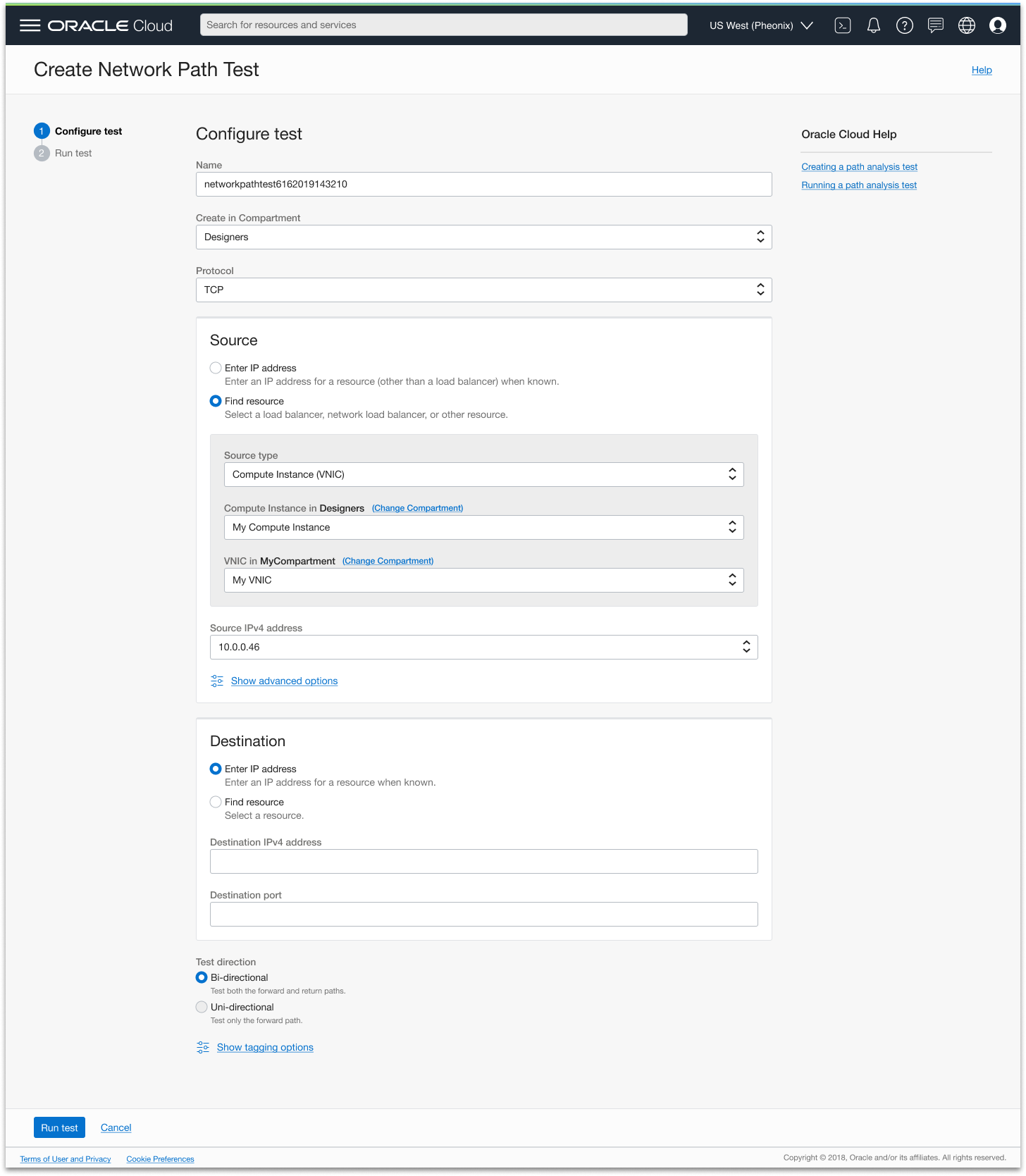
Designing the configuration step
The first interaction a user has with Network Path Analyzer is defining the path they want to test — specifying a source and destination resource. The team's initial instinct was to keep this simple: let users paste in an IP address directly. It was a reasonable engineering approach, but I pushed back because it didn't reflect how users actually work. Most OCI customers don't have their resource IP addresses memorized — they know their infrastructure by name. Asking them to look up an IP address before they could even start a test would add friction at the very first step of a tool designed to reduce friction.
I advocated for a "find resource" flow that lets users filter through a hierarchy of parent resources by name — starting from the top-level container and drilling down until they reach the specific resource and its IP address. Despite the additional engineering effort, the team aligned on the approach after I made the case that the simpler implementation would undermine the tool's core purpose for the users who needed it most.
Exploring the results view
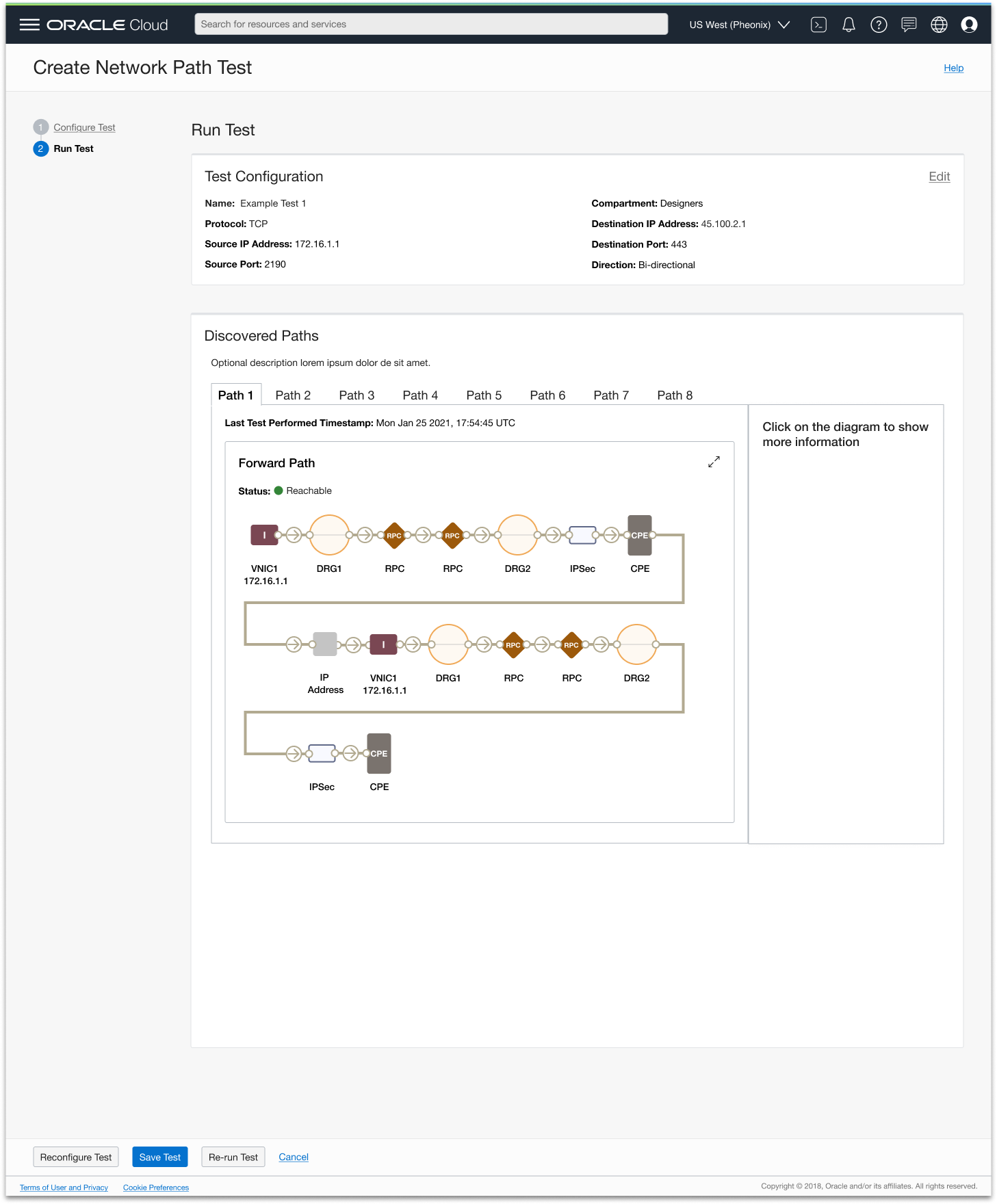
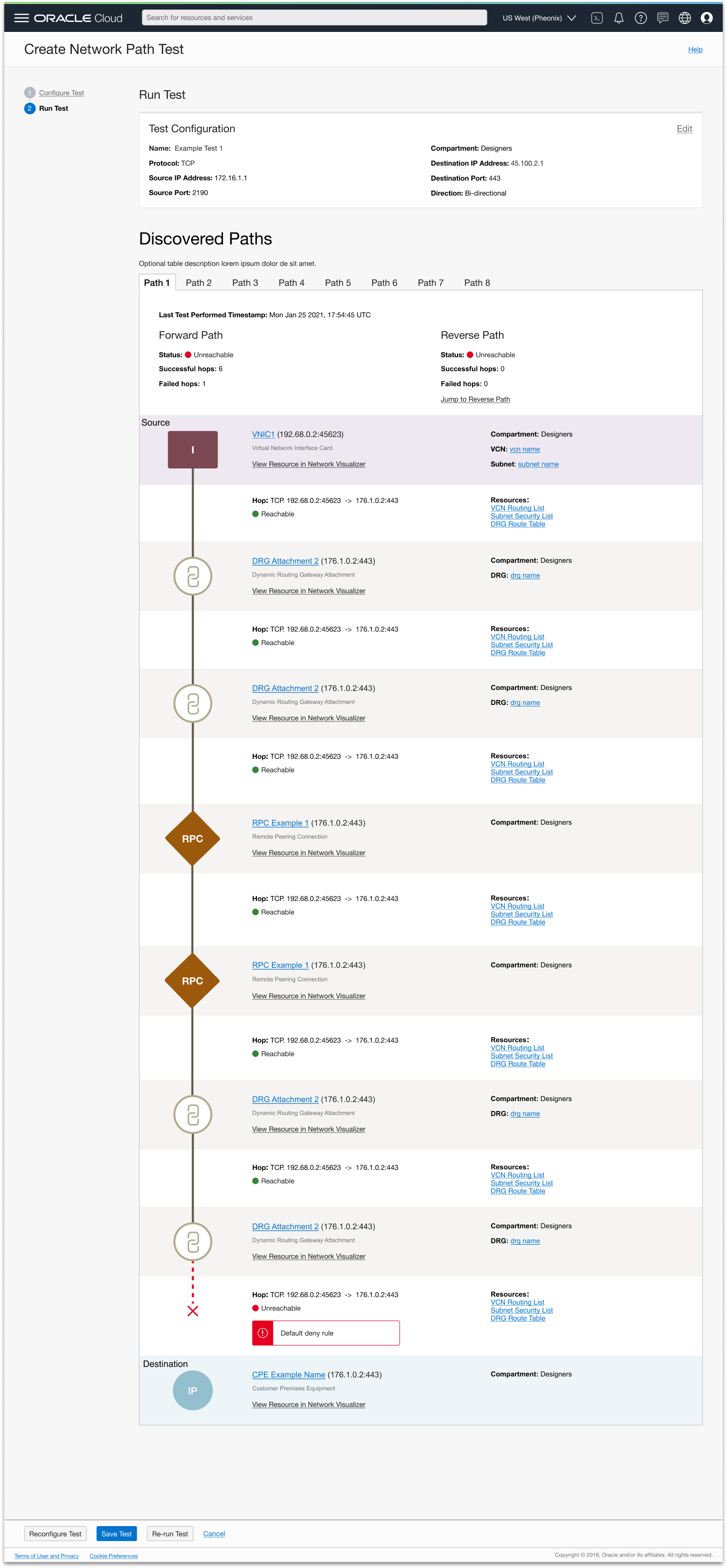
With the configuration step defined, I turned to the most complex design challenge of the project: how to visualize the path itself. The results view needed to show every hop from source to destination, surface detailed information about each resource along the path, and make it immediately clear where a misconfiguration had occurred — all without overwhelming engineers who were already dealing with a stressful troubleshooting scenario.
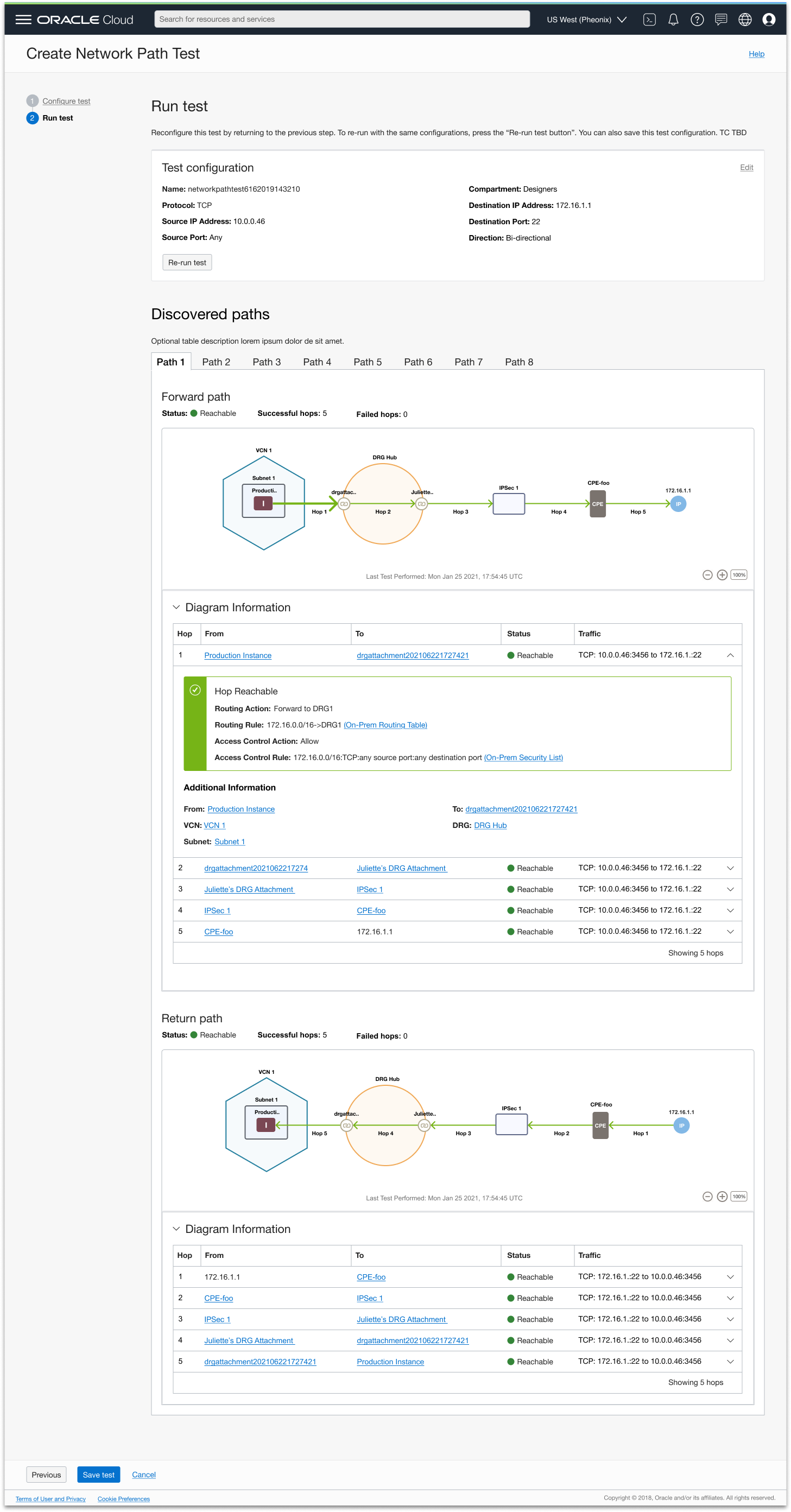
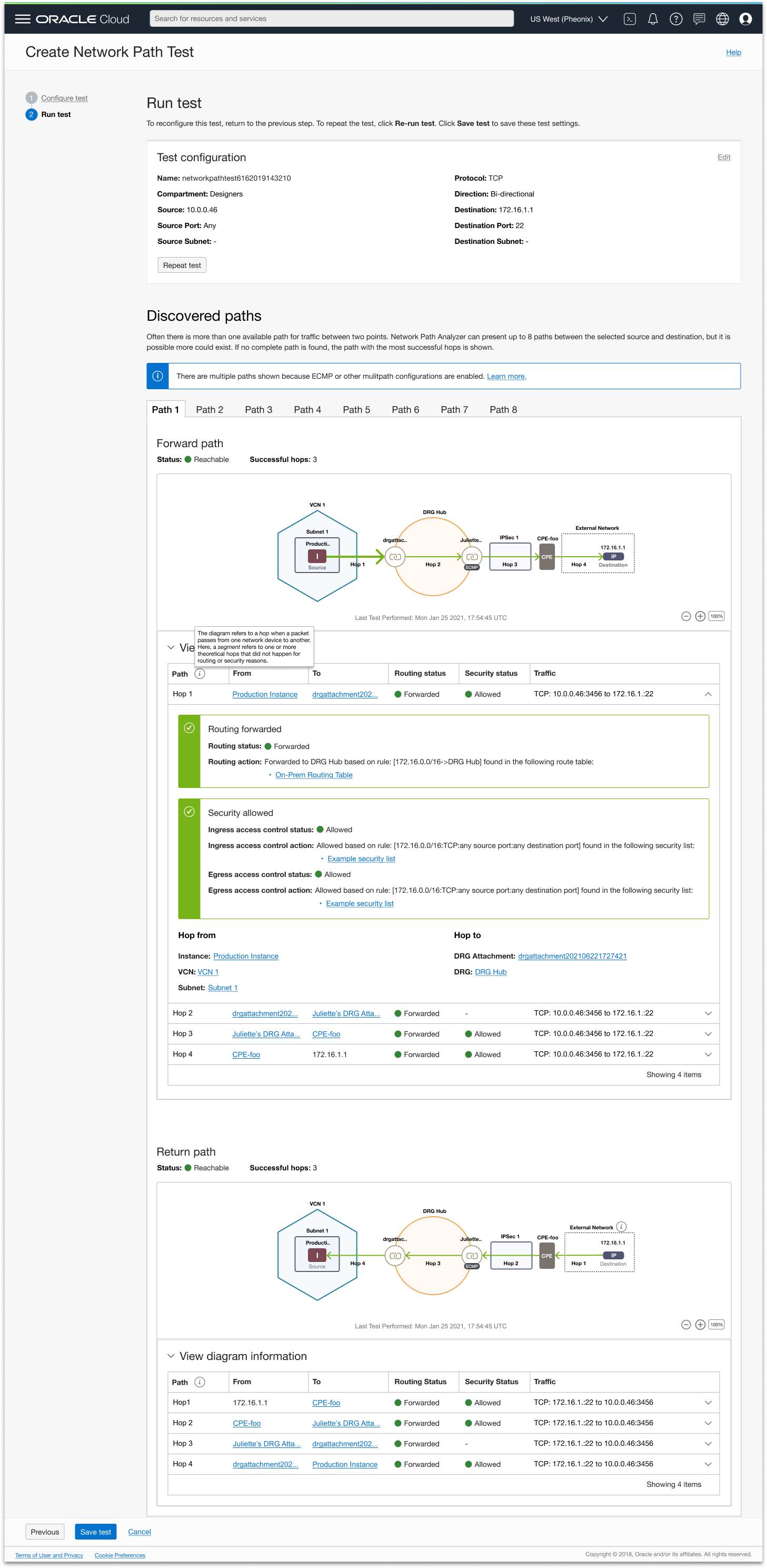
There was an additional layer of complexity beyond just managing information density. OCI resources exist in hierarchical relationships — a compute instance lives inside a subnet, which lives inside a VCN. Showing a simple left-to-right sequence of nodes would misrepresent how the network is actually structured, which would make the tool less intuitive and less useful for understanding why something went wrong. I wanted the visualization to reflect true resource relationships, not just the order in which traffic passes through them.
I explored multiple layout directions with both goals in mind. A zigzag layout felt visually interesting but made it hard to follow the path at a glance. A vertical layout was cleaner but couldn't represent the nested relationships between resources without becoming confusing. An expand/collapse approach managed complexity but hid too much information by default, forcing users to interact before they could get a sense of what had gone wrong.
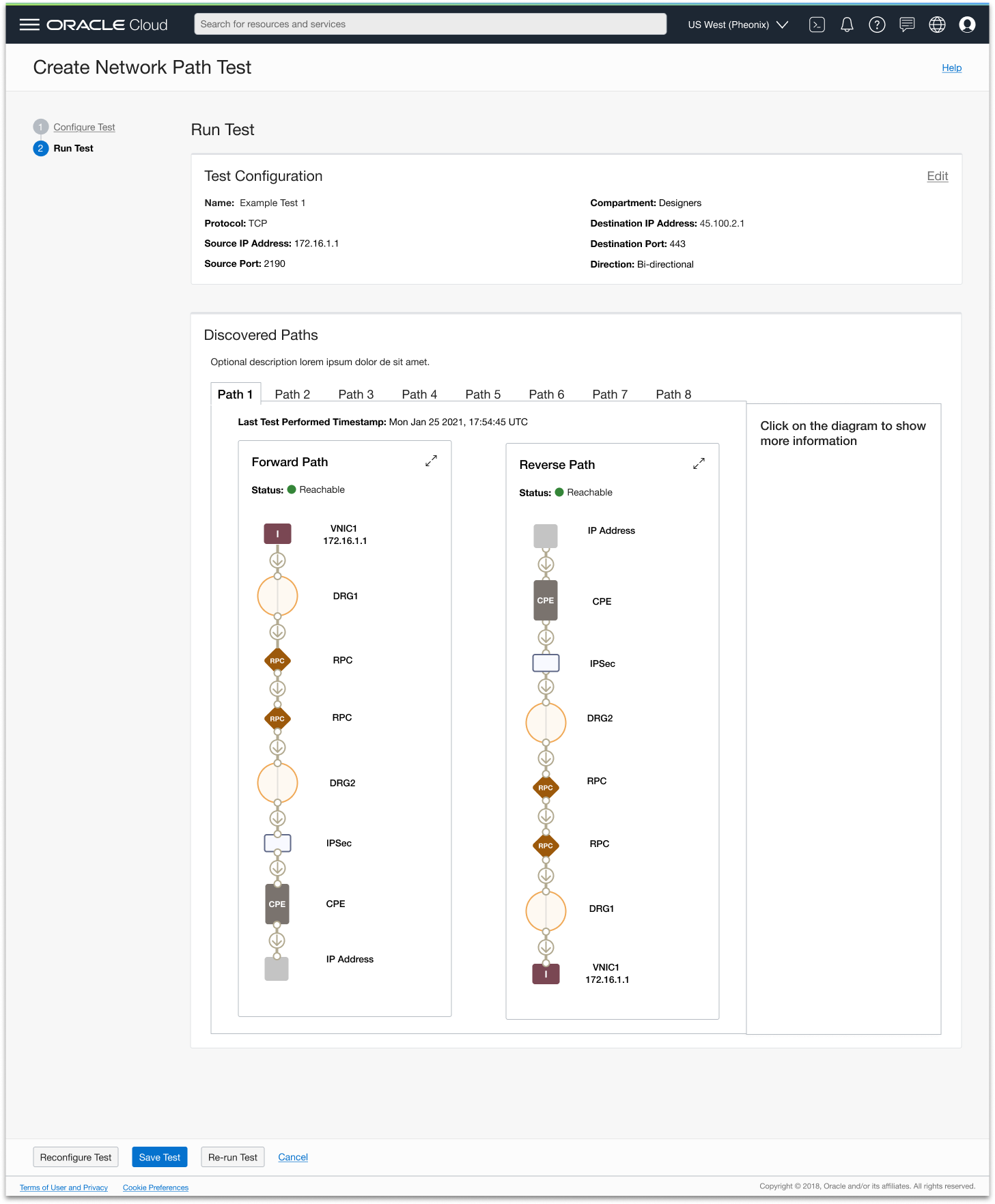
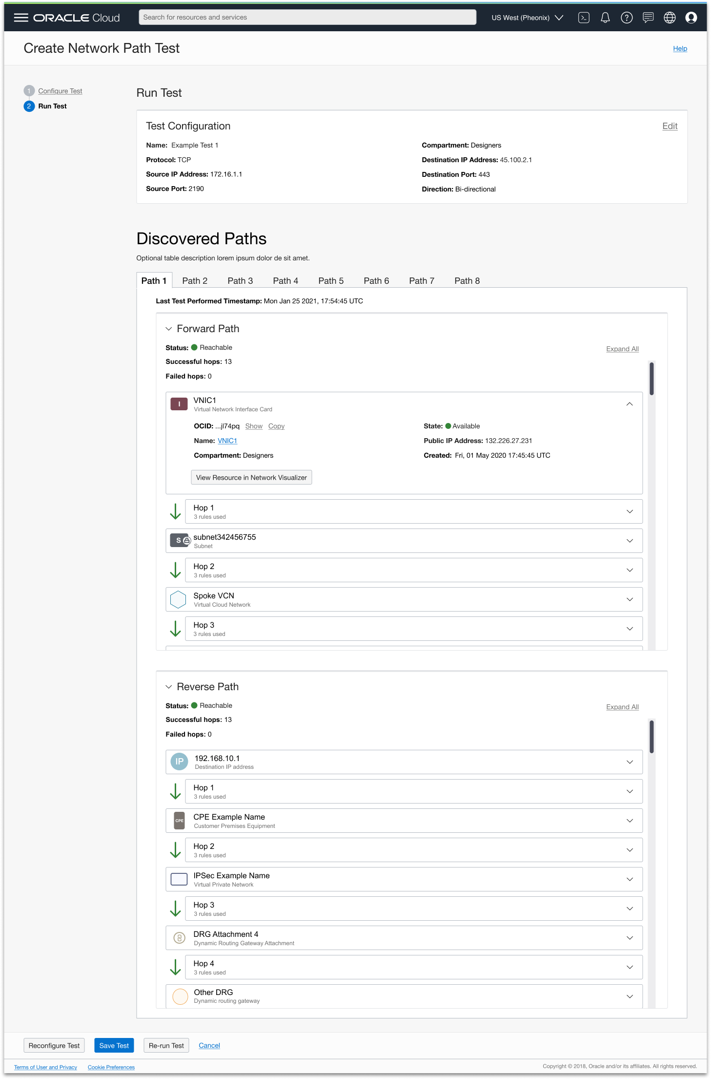
Separating visualization from detail
Each layout direction exposed the same core tension: the more detail and hierarchy I tried to show in the diagram itself, the harder it became to read. The breakthrough was decoupling the visualization from the detail entirely.
At the top, a clean left-to-right path diagram gives engineers an at-a-glance view of the route and where it breaks down — with resource hierarchy shown through visual nesting, so a compute instance appears inside its subnet, which appears inside its VCN. This gives users an accurate representation of their network structure, not just a simplified sequence, making the diagram more intuitive and helping users understand how their network is set up at a glance. Failure points are marked clearly so engineers can immediately see where the path broke down.
Below the diagram, an expandable table surfaces all the detailed information for each hop. I think of the table as the screen reader version of the diagram — the same information, just written out rather than visualized. Engineers can triage at the diagram level and drill into the table only when they need to investigate a specific resource, with a direct link to where in the console they can fix the issue.
This progressive disclosure approach resolved the tension between giving users the detail they need to troubleshoot and keeping the interface readable at a glance — while preserving the accuracy of the underlying network model.
Visual refinement
With the core structure in place, I anchored the designs in Oracle's existing networking design system to ensure consistency with the broader OCI console experience. I refined visual elements — arrows, node shapes, hierarchy indicators, failure markers — to ensure clarity while preserving the established visual language. I also built out the interaction details, including clickable arrows that reveal rule-detail tables, so users could explore without the interface becoming overwhelming before they chose to dig in.
Phase 3: Validate and iterate
Customer interviews
I built clickable prototypes mapping back to realistic use cases (reachable and unreachable path tests). In interviews, I used a targeted script to uncover mental model gaps, wording confusion, or visualization misinterpretation with questions like “What information do you want to see at first glance on the diagram or in the table?” and “Given the information we have shown in the unreachable path, how would you go about fixing the problem?”. Feedback surfaced changes like adding a clarifying description above the path visualization area, labeling the source and destination resources, and marking failure points with clear “X”s.
Developer handoff
Once design was stable, I prepared full walkthroughs for engineers, conducted a leadership demo, and gathered UX board approval. During handoff, I joined recurring dev check-ins to clarify design intent, respond to implementation questions, and adjust for technical constraints without compromising usability.
Post-launch iteration and feature enhancements
Design didn’t end at initial launch. I continued to improve the service through feature enhancements like cross service linking, helping users onboard to the service more easily though a prerequisites workflow, and supporting larger scale path tests to support bigger OCI customers.
Results
The release of Network Path Analyzer introduced a powerful new way for OCI customers to diagnose and validate their network configurations without sending live traffic. Through an intuitive, simulation-based interface, users can visualize network paths, identify misconfigurations, and verify connectivity intent with confidence. By enabling customers to troubleshoot network issues independently, the tool reduces reliance on support teams and accelerates resolution times, creating a more efficient and self-service troubleshooting experience.