Stitch HQ
I created a mobile app designed to be the one place a sewist has everything they need — from uploading a pattern and getting AI-powered guidance, to tracking their fabric stash and sharing finished work with a community that understands the craft.
My role
Solo designer
The problem
Sewists have everything scattered and nothing connected.
Sewing is an inherently complex craft. A single garment project requires choosing a pattern, understanding fabric requirements, buying the right yardage, pre-treating fabric correctly, interpreting dense technical instructions, and tracking what materials you have left over. Most sewists manage this across multiple apps, websites, notebooks, and memory.
As a sewist myself, I experienced this fragmentation firsthand. When I looked at the existing app landscape, I found tools that addressed pieces of the problem in isolation — a pattern catalog here, a stash tracker there — but nothing that brought the full journey together, and nothing that used AI to genuinely reduce the cognitive load of the craft.
Platform
Mobile app
Tools
Google Stitch
Project timeline
1 week
My solution
I designed a single app that serves as a sewist's complete headquarters, from the moment a pattern is uploaded to the moment a finished garment is shared with the world.
The process
Define
Rapid prototyping
Review and refinement
User research
Competitive Analysis
Iterate
Rapid prototyping
Testing AI design tools to find the right starting point.
With a clear concept defined, I used this project as a deliberate opportunity to evaluate the current landscape of AI-powered design tools. I took the same detailed product brief and ran it through four tools simultaneously: Claude, Figma Make, Google Stitch, and Cursor, both as a learning exercise and to identify which would best support my design process through iteration.
The brief:
One prompt, four tools
The prompt described the full product in detail: pattern upload via document or photo scan, fabric recommendations with care and yardage guidance, an AI-enriched project walkthrough, and a fabric stash tracker with post-project prompts to update inventory.
The outcome
Google Stitch as the clear winner
Google Stitch produced the output closest to the intended visual direction and app structure. While the first prototype had UI inconsistencies and some rough edges, it captured the general flow, hierarchy, and aesthetic I was aiming for well enough to be a genuine starting point — not just a reference.
The ability to go from a written product concept to a multi-screen, visually coherent prototype in a single session fundamentally changes how quickly a designer can get to the questions that matter — what's missing, what's wrong, and what needs to change.
Reviewing the first Stitch prototype critically, I identified two features that were absent but clearly necessary: a profile tab where users could store their body measurements for AI-powered size recommendations, and a persistent AI chat accessible throughout the project walkthrough. These gaps wouldn't have been as obvious without something tangible to react to — which is precisely the value of rapid prototyping as a UX method.
Using AI tooling to accelerate the early stages of a design process is a skill I'm actively developing and one I consider a genuine part of my practice. The goal is never to outsource design judgment — it's to spend less time on scaffolding and more time on the decisions that actually require a designer.
Research
In-person interviews and hands-on competitive analysis.
Rather than relying on assumptions from my own experience, I took a rough early prototype to a local sewing store to test it with real users. I also downloaded and used the leading sewing apps on the App Store firsthand, going through their onboarding flows, uploading patterns, and attempting to use their AI features.
User research findings
Finding 3:
"I'd love to photograph my fabric to add it."
Manual data entry is the primary friction point for stash tracking. Response: Add photo-based fabric intake with AI auto-identification of material and composition.
Competitive analysis
Finding 4:
"I love the idea of instructions being given in a more intuitive way."
"Standard sewing pattern instructions are dense and technical. Response: AI-generated walkthrough with enriched steps, Tailor's Secret tips, and visual guides — always alongside the original for reference.
I conducted hands-on analysis of the two most relevant competitors, documenting specific UX successes and failures through first-person use.
| App | Pattern upload | AI walkthrough | Fabric stash | Size rec. | Community |
|---|---|---|---|---|---|
| Sewpal | No — internal library only | Broken AI entry point | No | No | No |
| Stash Hub | Manual entry only | No — catalog only | Yes — but overwhelming | No | No |
| Stitch HQ | PDF or photo scan | AI-enriched | Optional, photo-first | AI rec with body measurements | Community makes and discussion board |
Sewpal's "Need help for my current project" button opened the camera instead of a chat window. To ask a text question, I had to press the "Looking for new ideas" button as a workaround. This single interaction failure informed one of Stitch HQ's core design principles: AI should always be immediately, unambiguously accessible.
Finding 1:
“Current social media is not great for this."
Instagram hashtag search is unreliable for finding how other people made a specific pattern. Response: Design a community gallery built around patterns, not hashtags — with AI-generated tags to make finished work discoverable.
Finding 2:
"I tried a fabric catalog app and stopped using it."
"Cataloguing fabric feels laborious when it's mandatory. Response: Make the stash entirely optional — useful for those who want it, never a barrier for those who don't.
Design
Six core experiences, one cohesive system.
The app is structured around the complete arc of a sewing project — from setup and discovery, through active making, to completion and community sharing. Each section was designed to work independently so the app is useful at every stage, not only when a user engages with all features.
Experience 1
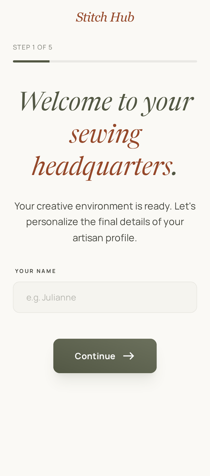
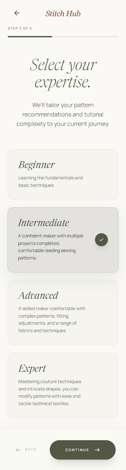
Onboarding that earns personalization
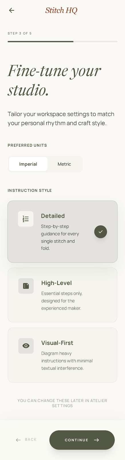
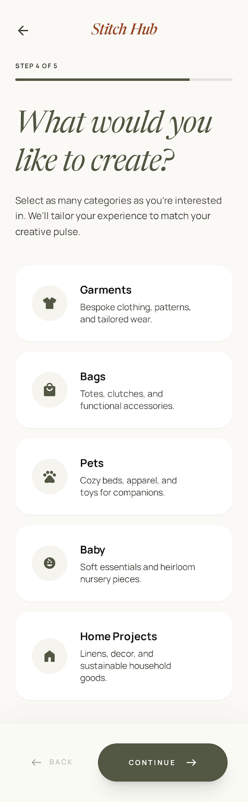
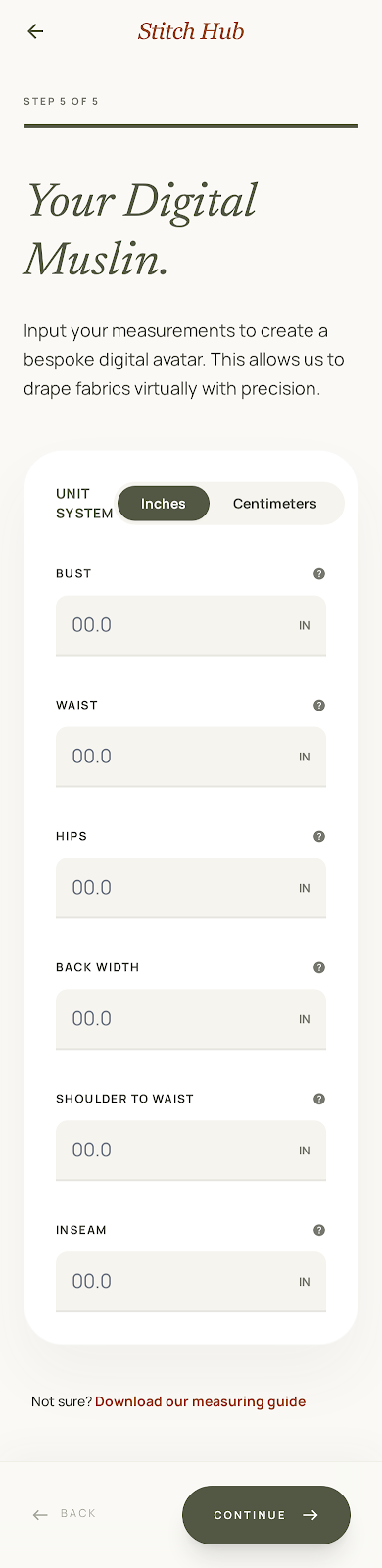
The onboarding flow collects five things across five low-friction steps: name, skill level, preferred units of measurement, instruction style, and body measurements. Each question has a clear reason to exist — not to fill a database, but to make every subsequent interaction more relevant.
Skill level uses rich descriptions that help users self-identify accurately. The instruction style preference (Detailed, High-Level, or Visual-First) directly shapes how the AI walkthrough presents steps — a feature that both competitive analysis and user research independently validated as a priority.
The measurements step is framed as "Your Digital Muslin" — a term that resonates with sewists and explains the purpose immediately. It powers AI size recommendations on every uploaded pattern, solving one of the most persistent pain points in sewing.
Experience 2
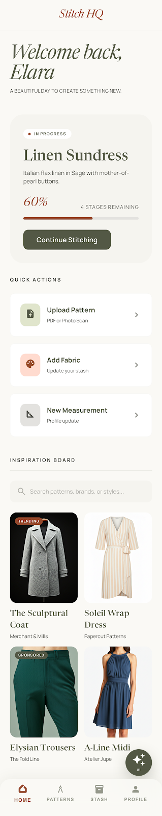
A home that picks up where you left off
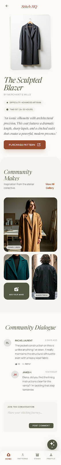
The home screen is built around the in-progress project — surfacing completion percentage, fabric details, and a direct "Continue Stitching" CTA so the user can resume immediately without navigating. Quick Actions (Upload Pattern, Add Fabric, New Measurement) serve the most common entry points without requiring tab navigation.
The Inspiration Board, drawn from a competitive analysis insight from Sewpal, surfaces curated patterns from real brands with external purchase links. Sponsored placements are clearly labelled, forming the foundation of a B2B revenue model that keeps the app free for users while respecting the ecosystem of independent pattern designers that serious sewists support.
Experience 3
Patterns that know who you are
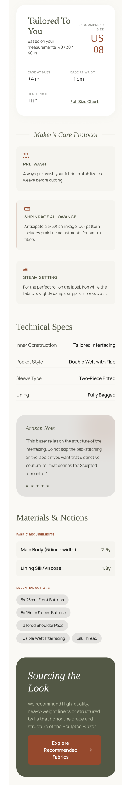
When a user uploads a pattern — by PDF or photo scan — the app reads it and generates a rich detail view. The "Tailored To You" section uses the user's saved body measurements to recommend a specific size, displaying the recommended size prominently alongside ease allowances and a full size chart for reference.
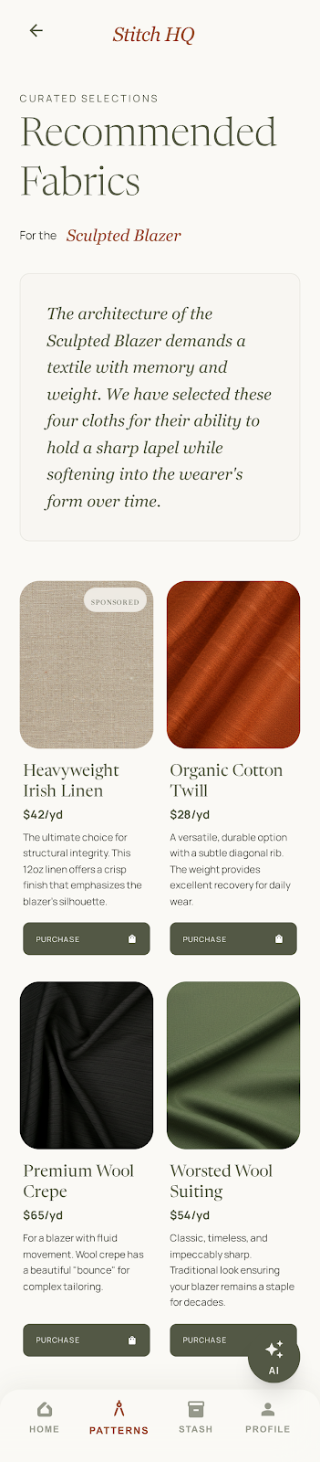
The Maker's Care Protocol surfaces fabric pre-wash requirements, shrinkage allowances, and pressing guidance directly from the pattern — information that is often buried or absent in original pattern materials. The Materials & Notions section provides a clear cut list, and the "Sourcing the Look" section links to AI-curated fabric recommendations with direct purchase links.
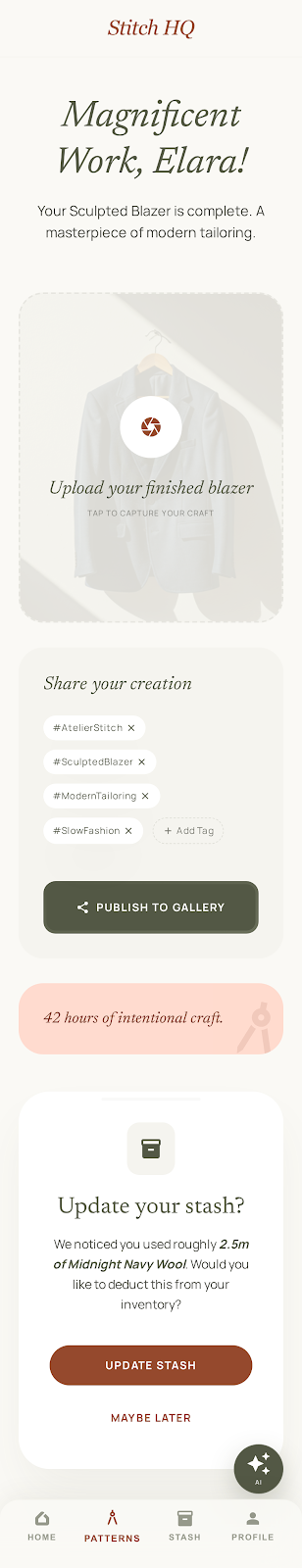
The project completion screen closes the full loop.
When the final step is marked complete, the app celebrates the moment with a personalized congratulations, then does three things: it prompts the user to photograph and share their finished garment to the community gallery with AI-generated hashtags, addressing the discoverability issue documented in the user study; it tells them exactly how much fabric they used and asks if they'd like to deduct it from their stash; and it logs the completed project to their profile. Nothing is forced — every action is an invitation.
Experience 4
Instructions that teach, not just tell
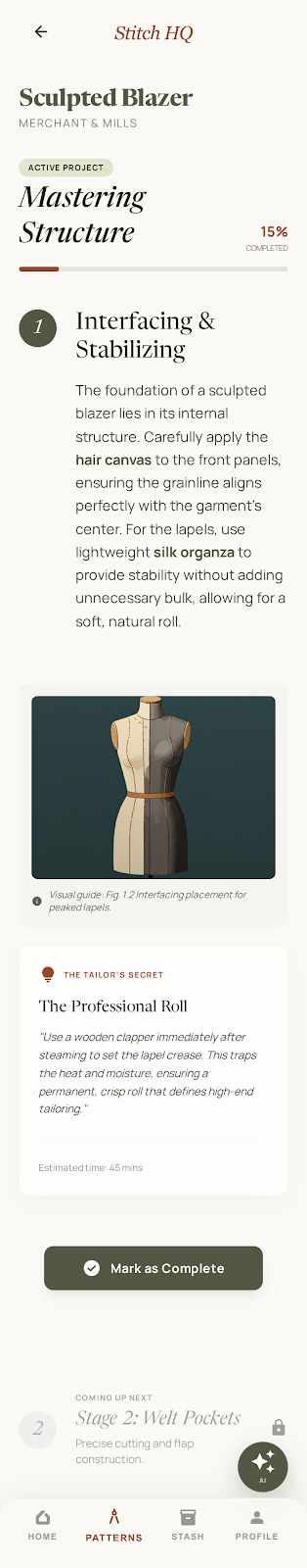
The project walkthrough is the core differentiator from every existing sewing app. Where competitors either skip instructions entirely or reproduce the raw pattern text, Stitch HQ generates a rich, stage-by-stage guide from the uploaded pattern.
Each step includes enriched body copy with key terms highlighted, a visual guide with a figure reference, an estimated time, and a "Tailor's Secret" callout — a pro tip surfaced from the AI that the original pattern wouldn't include. Progress is tracked by named stage and percentage, with the next stage always visible at the bottom to maintain momentum.
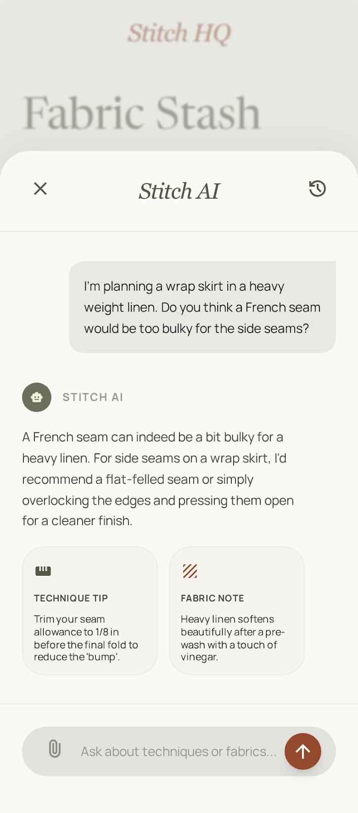
The Stitch AI button is always visible and accessible from any step — directly addressing the usability failure observed in Sewpal, where the AI help button triggered the wrong interaction entirely. The original pattern instructions remain accessible via a toggle for users who want to cross-reference.
Experience 5
Every pattern comes with a community who's already sewn it
The social layer emerged directly from user research — a participant described Instagram's hashtag search as unreliable and frustrating for finding how other people made the same pattern. Rather than building a generic social feed, Stitch HQ organizes community content around the pattern itself.
On every pattern page, a "Community Makes" section shows photos of other users' finished versions of that specific garment, alongside fabric notes. A Community Dialogue thread allows sewists to ask questions and share tips on that exact pattern — making the knowledge discoverable where it's needed, not buried in a personal feed.
After completing a project, users are prompted to add their make to the gallery with AI-suggested hashtags, making their work visible and searchable to others working on the same pattern.
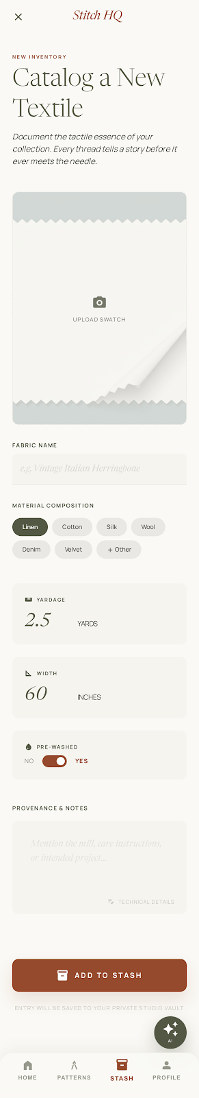
Experience 6
A fabric stash that respects your time
Both user research and competitive analysis delivered the same message: existing fabric catalog apps feel laborious. One interviewee had abandoned a previous app after finding the data entry too demanding. Stash Hub confirmed the pattern — an overwhelming number of required fields that alienate users before they see any value.
Stitch HQ's stash reduces fabric entry to five key fields: a swatch photo, fabric name, material composition (chip selectors, not a text field), yardage, and a single open notes area for anything else the user wants to capture. AI can identify the fabric from a photo and pre-fill the name and composition. The stash is entirely optional — users who don't want to track fabric lose nothing, and the rest of the app remains fully functional.
Outcome
A proven gap, filled with intent.
Competitive analysis and user research confirmed that the sewing app market has real demand but a significant usability and capability gap. No existing product combines AI-powered pattern guidance, intelligent fabric recommendations, stash management, size personalization, and community — and those that attempt pieces of it do so with friction that drives users away. Stitch HQ was designed to close that gap entirely.
Reflection
Process decisions that shaped the product.
This project sits at the intersection of several things I care about as a designer: using research to pressure-test assumptions rather than confirm them, integrating AI as a genuine design material rather than a surface-level feature, and making deliberate tradeoffs that prioritize the user's experience over product completeness. A few decisions stand out as worth examining.
Working simultaneously as the designer, the researcher, and the target user created a productive tension throughout. Domain expertise accelerated early concept development — but it also created blind spots that only real users could surface. The guerrilla research session at a local sewing store is the clearest example: the two findings that changed the product most (social discoverability and stash abandonment) were both things I hadn't anticipated, despite being a sewist myself. That's a useful reminder that proximity to a problem is not the same as understanding it from the outside.
When your own instincts become a design risk
As a sewist myself, I would use a fabric stash tracker, but that was almost a liability. User research revealed that others had tried catalog apps and abandoned them, and competitive analysis showed why. Tools like Stash Hub overload the user with so many fields that they give up before seeing any value. The research didn't just change a feature, but it challenged my assumption that my own behaviour was representative. The stash became optional, with a minimal form inputs that respects the user's time. Users who want it get a powerful tool. Users who don't are never slowed down.
Using AI tooling to accelerate design judgment
Evaluating four AI design tools in parallel — Claude, Figma Make, Google Stitch, and Cursor — against the same prompt was a deliberate skill-building exercise as much as a workflow decision. The value wasn't just in generating screens faster, but also in having multiple options to start with go get inspiration. Speed to a testable artifact is a competitive advantage for a designer.
AI as product infrastructure, not product differentiator
The temptation with AI features is to surface them — to make the AI visible because it signals modernity. The more interesting design challenge is making AI invisible: size recommendations that feel like the app just knows you, fabric identification that removes a form, hashtags that appear already written. Every AI touchpoint in Stitch HQ is designed to feel like the product working, not like AI working. That distinction matters more as users become increasingly accustomed to AI in the products they use.
Product thinking alongside UX thinking
Designing the B2B sponsored placement model — rather than defaulting to a user subscription — required stepping back from screen design and asking how the product sustains itself without creating friction for the user. The answer (pattern brands pay for visibility, users get the app free) is aligned with how the sewing community already operates: around trusted brands and independent designers, not proprietary content libraries. That kind of systems thinking is what separates a feature from a product.